Unsiloed Leads ChartParse-Bench in Chart Extraction Accuracy
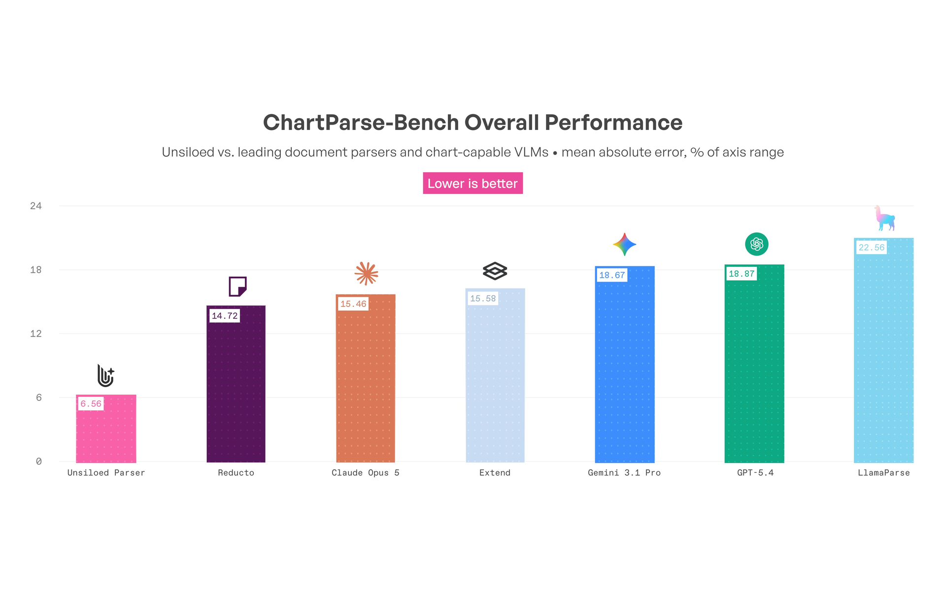
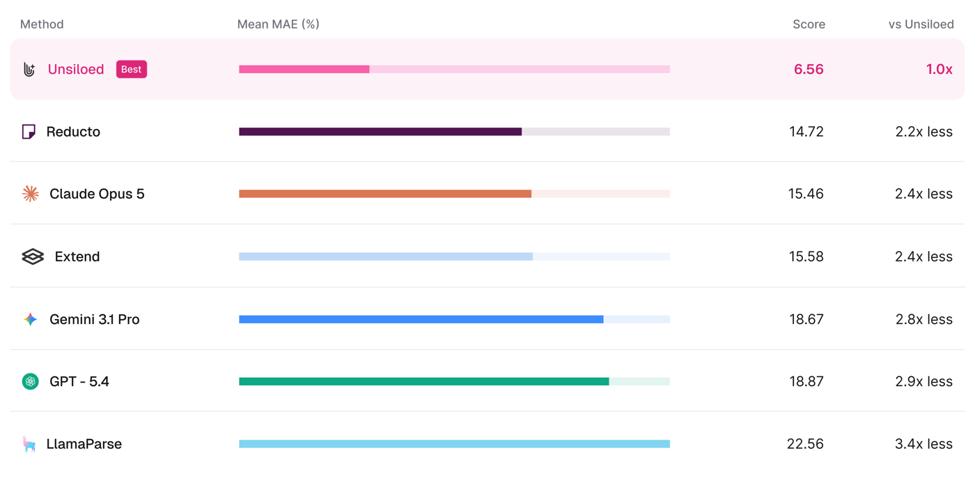
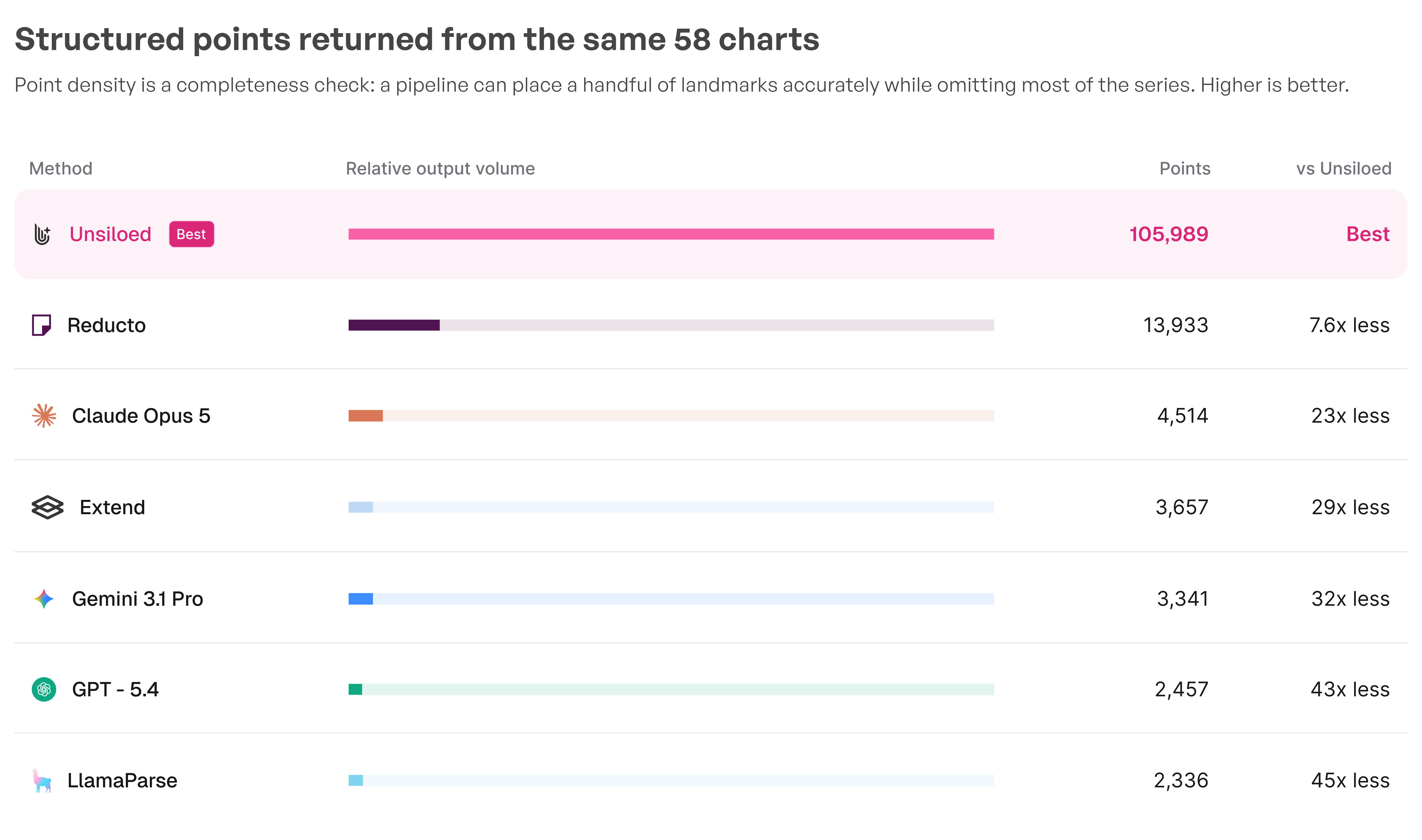
Charts hold decision-critical numbers that most parsers reshape or drop. We present the Unsiloed chart parsing pipeline and ChartParse-Bench, a 58-chart benchmark where Unsiloed leads on both mean absolute error (6.56%) and point density (105,989 extracted coordinates).

Every industry runs on chart data. Some of the most decision-critical numbers in quarterly earnings reports, clinical trial results, insurance filings, and engineering specifications live not in text or tables, but inside bar charts, line plots, and scatter diagrams.
Vision language models (VLMs) continue to improve at document parsing, but charts present a distinct challenge. Their meaning depends on the relationship between marks, labels, legends, and axes. A parser can recover the overall shape while changing the values or omitting most of the underlying points, passing those errors to quantitative analysis, chart question answering, and retrieval-augmented generation (RAG) applications.
In this article, we present the Unsiloed chart parsing pipeline, compare leading VLMs and document-parsing pipelines on complex real-world charts, and evaluate them with ChartParse-Bench, a hand-curated dataset designed to test how accurate our and current state of the art chart parsing pipelines are.
Why LLM Applications Need Structured Chart Data?
An LLM can describe the apparent trend in a chart without recovering the observations behind it. That may be enough for a summary, but it is not enough to answer questions such as "What was the value in 2019?", identify a crossover, calculate a rate of change, or compare two series.
RAG works best when the retrieval layer can find explicit values, labels, and relationships. Converting the chart into structured series data gives downstream systems a stable representation they can search, filter, and calculate over.
How Unsiloed's Chart Parsing Pipeline Handles Different Chart Types?
A single general-purpose model has to handle different visual problems. A dense line chart requires the parser to trace overlapping series through crossings, while a bar chart requires it to locate discrete marks and bind each one to the correct category and scale.
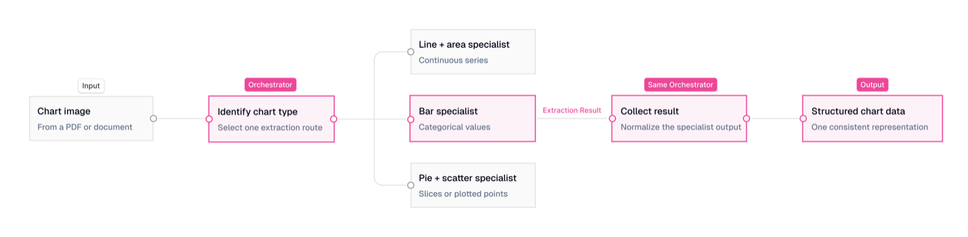
Unsiloed uses an agentic harness to identify the chart and route it to agents specialized for different chart families. Separate agents are tuned to handle charts of various types like line and area charts, bar charts, and pie and scatter plots with special tools to aid in the process. Each specialist can apply the image-processing approach suited to that geometry instead of forcing every chart through the same extraction path.
The harness coordinates the result so downstream applications receive one structured representation rather than a collection of unrelated model responses.
The diagram below shows how the agentic harness selects one chart-specific extraction route:
Comparing Chart Parsing Pipelines on Complex Real-World Charts
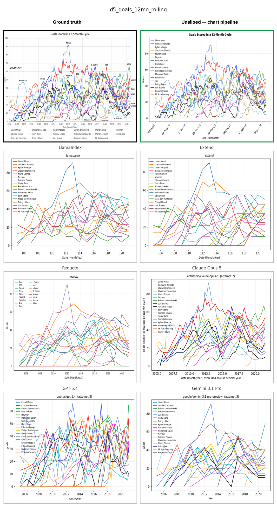
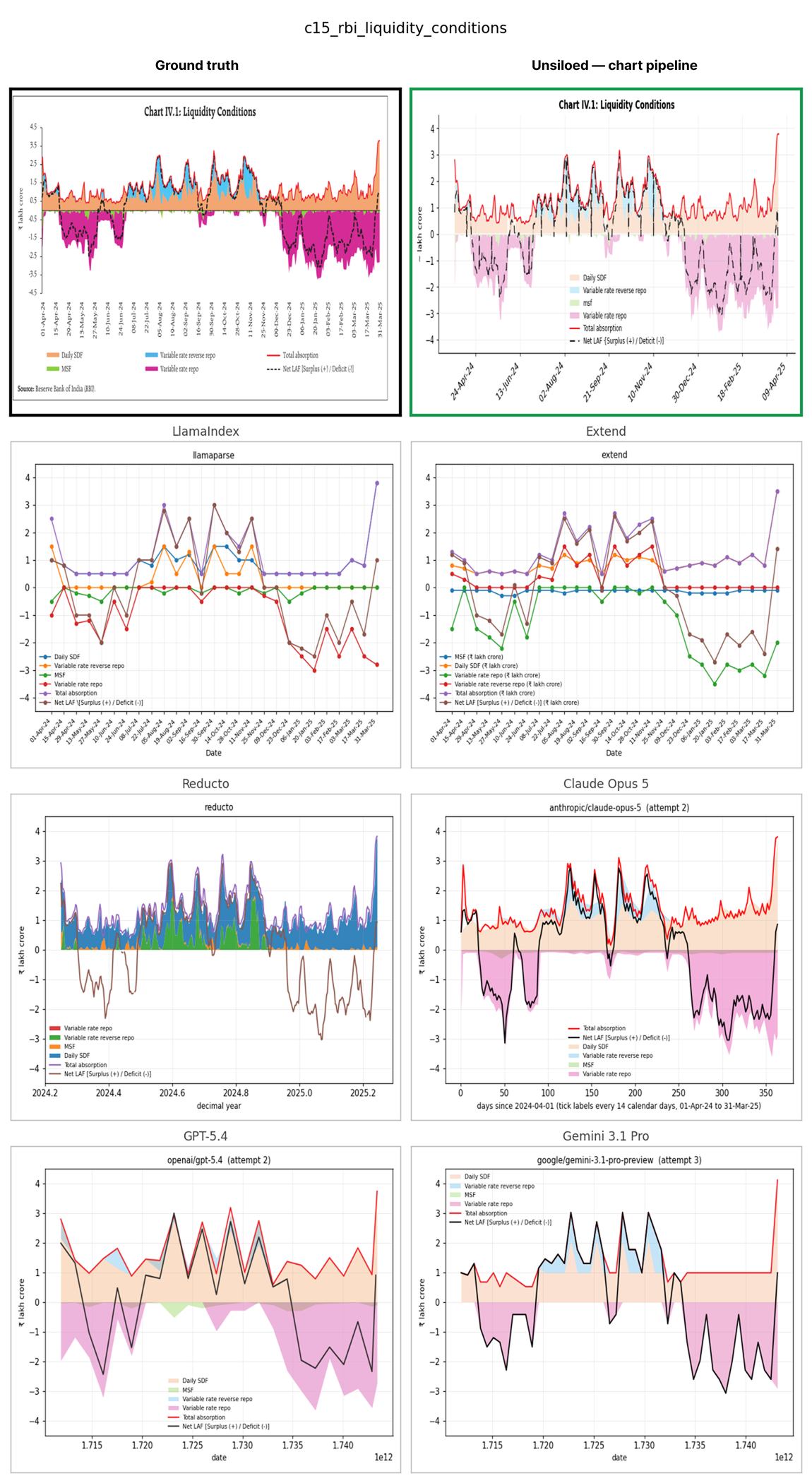
Real-world charts are important since they prove that our pipeline works well on messy charts found in production scenarios across various industries. Across the following qualitative examples, we display the 2 main groups of failures many chart parsing pipelines face which our agentic system is robust to.
The Output Has The Correct Outline But Incorrect Chart Value Extracted
A parser can preserve a chart's outline while changing its coordinate system or attaching the wrong values to it. In the following chart below Unsiloed is the only parser to maintain chart accuracy and structure very perfectly.
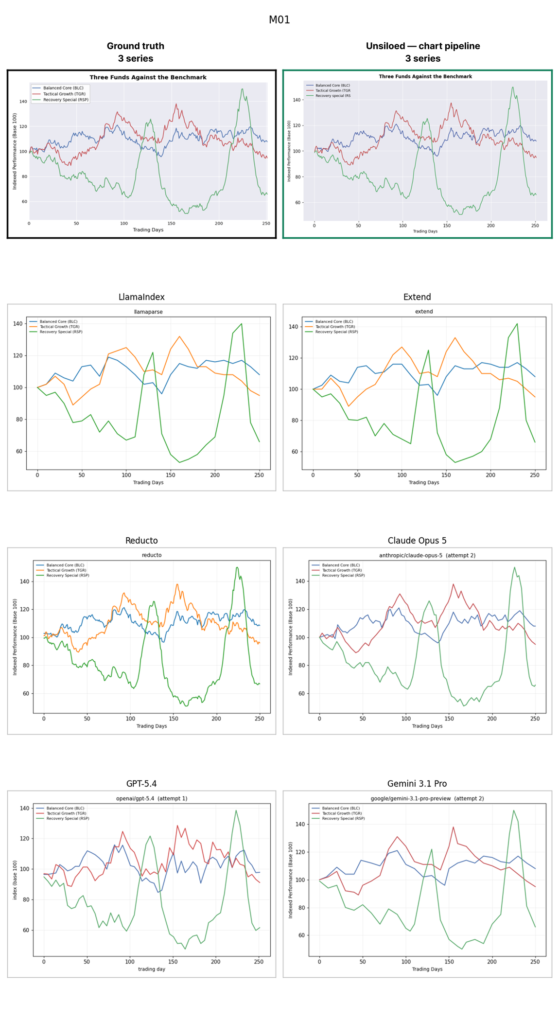
Errors are harder to notice when a reconstruction remains visually plausible. In the three-fund comparison, Unsiloed follows the source curves closely. GPT-5.4 adds sharp fluctuations that are not present in the source, while several other outputs smooth the curves into a smaller set of points.
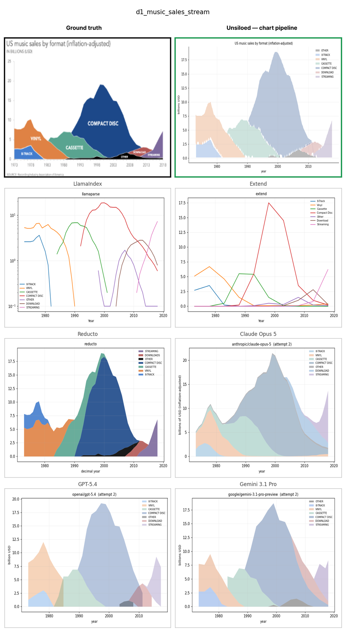
Sparse Output Hides Missing Data
Stacked area charts make missing structure especially damaging because each series is defined by both its upper and lower boundary. Unsiloed returns the formats as bands in their original order and scale. LlamaParse and Extend separate the bands into independent lines, changing what the values mean.
The 10-series comparison makes the missing points visible. Unsiloed traces all 10 series across approximately 250 trading days.
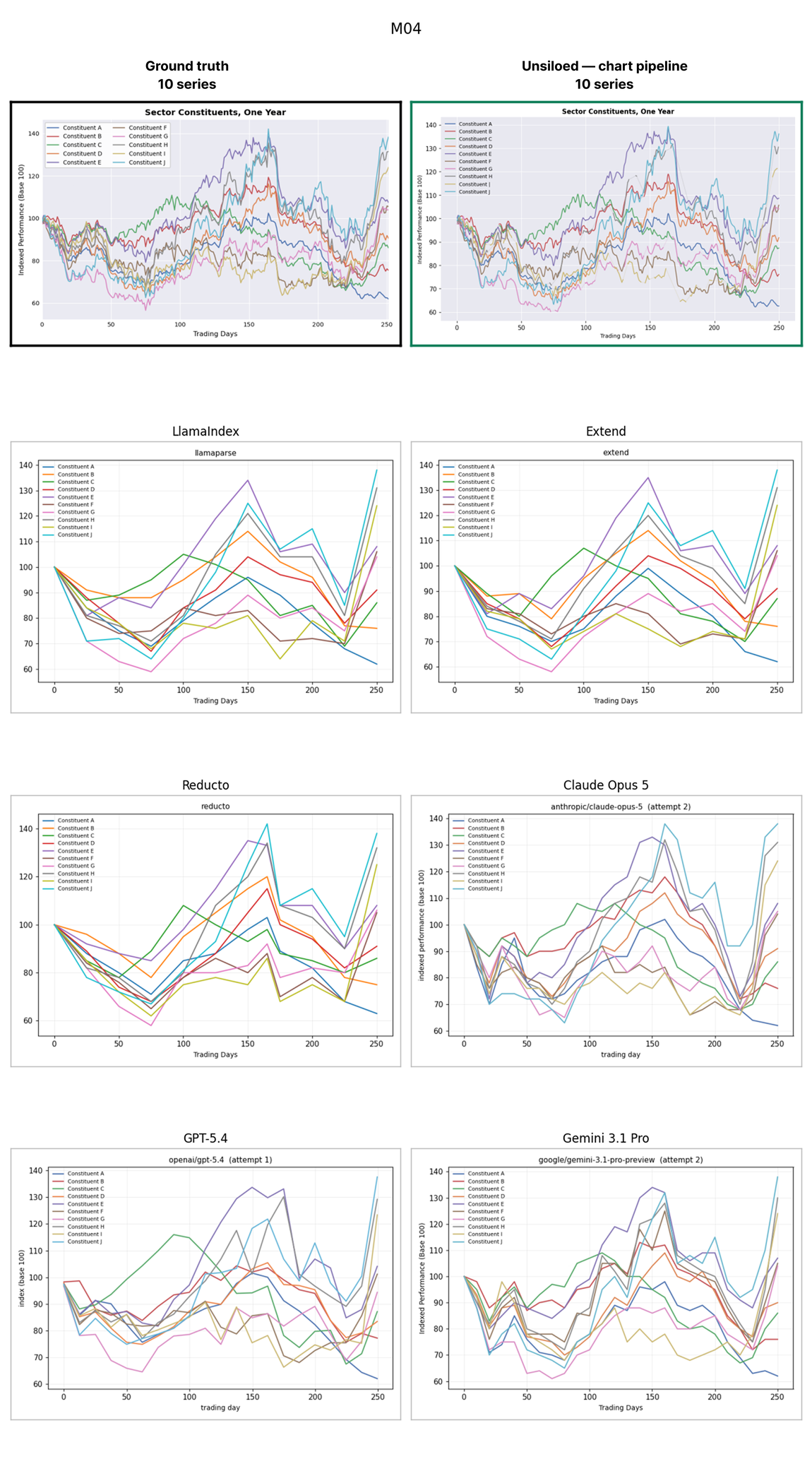
These examples demonstrate the failure modes, but they cannot establish the size of the error. Quantitative evaluation requires synthetic charts whose underlying values are known.
ChartParse-Bench: A Chart Parsing Benchmark
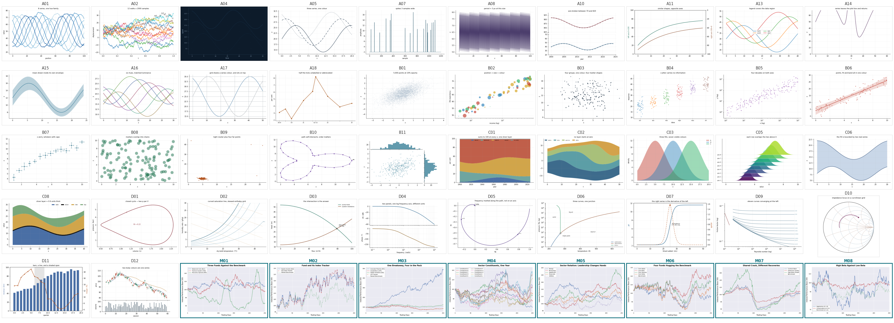
Understanding the gaps of qualitative evaluation and driven by our belief in a robust evaluation, we present ChartParse-Bench. ChartParse-Bench is a synthetic chart parsing benchmark that provides ground truth for errors that can only be observed qualitatively in real documents. It contains 58 charts and ground-truth points generated with Matplotlib. Each chart isolates a predefined failure mode, such as swapping series at a crossing, interpolating through a gap, or treating a hatched fill as data. This dataset will help us have a quantitative evaluation of our chart parsing pipeline. It is hosted on Hugging Face at Unsiloed/chart-parse-bench.
The benchmark covers five chart families:
- Line charts (18): Series identity through crossings, resampling, and axis binding
- Scatter plots (11): Recall under overplotting, size and shape channels, and outliers
- Area charts (nine): Stacking, computed baselines, and composited fills
- Compound charts (12): Non-Cartesian frames, linked panels, and mixed geometries
- Market charts (eight): Correlated series that move together
Quantitative Measurement of Chart Parsing Pipelines
We utilise 2 important metrics to effectively measure how accurate our chart parsing baseline is.
1. Mean absolute error (MAE) measures how far each extracted value is from the value used to generate the chart. The benchmark averages these differences across the evaluated points and expresses the result as a percentage of the axis range. Lower MAE means the reconstructed values sit closer to the ground truth.
MAE however only scores the points a parser emits. A model can return a dozen well-placed landmarks from a 500-point series and receive a reasonable error score even though it omitted most of the data.
2. Point density exposes that omission by comparing the volume of structured points produced by each pipeline. It acts as a completeness check alongside MAE. Both numbers are needed because dense output can be inaccurate, while accurate output can be too sparse for interpolation, crossover detection, trend fitting, or point lookup.
Benchmark Results
The first result compares the mean absolute error of all seven pipelines across the benchmark.
The second compares how many structured coordinates each pipeline returned from the same 58 charts.
Reliable Chart Data Makes Downstream Answers More Reliable
Charts can look correctly reconstructed while their values, series identities, or sampling resolution have changed. Those errors become difficult to detect after the original image has passed through a document pipeline and only the extracted representation reaches the application.
For RAG, chart question answering, and quantitative analysis, parsing quality therefore depends on both accuracy and completeness. Preserving the values is necessary, but so is preserving enough of the series for downstream systems to calculate over the data rather than infer from a simplified outline.
Sign up and test Unsiloed on your most challenging document use cases.